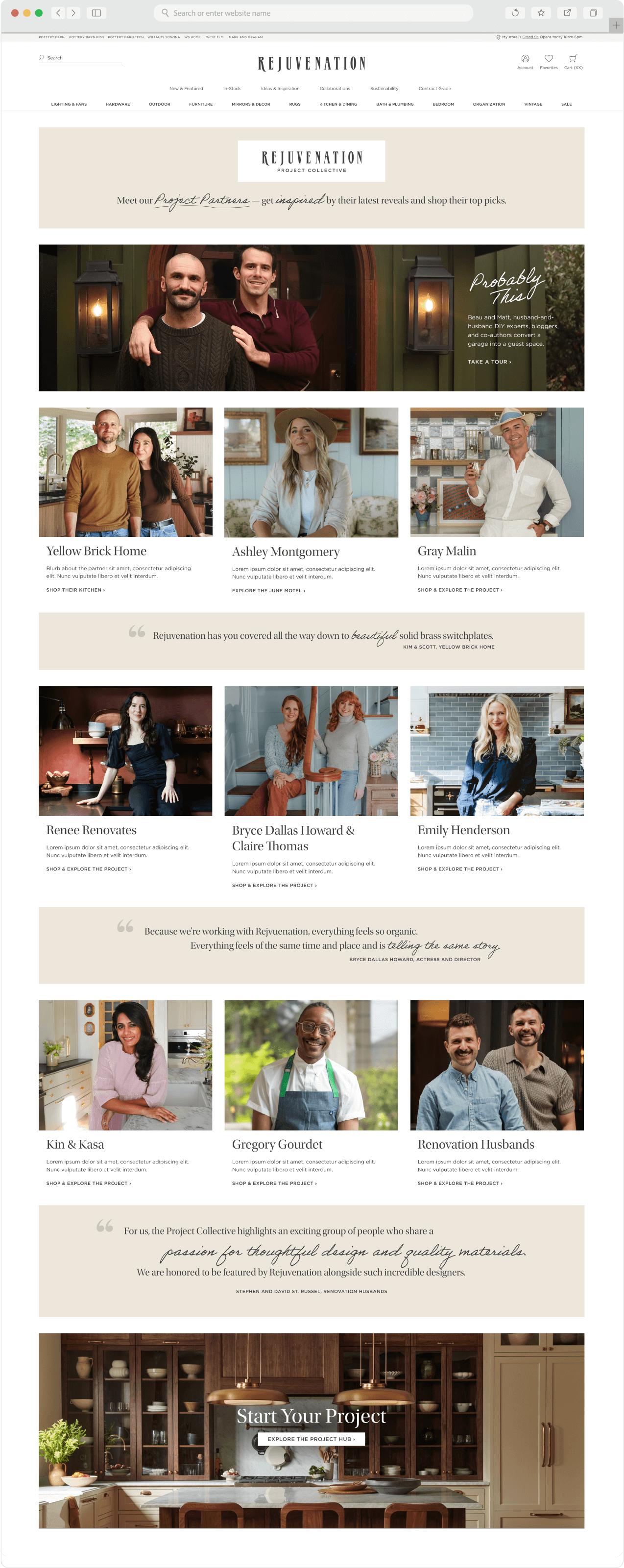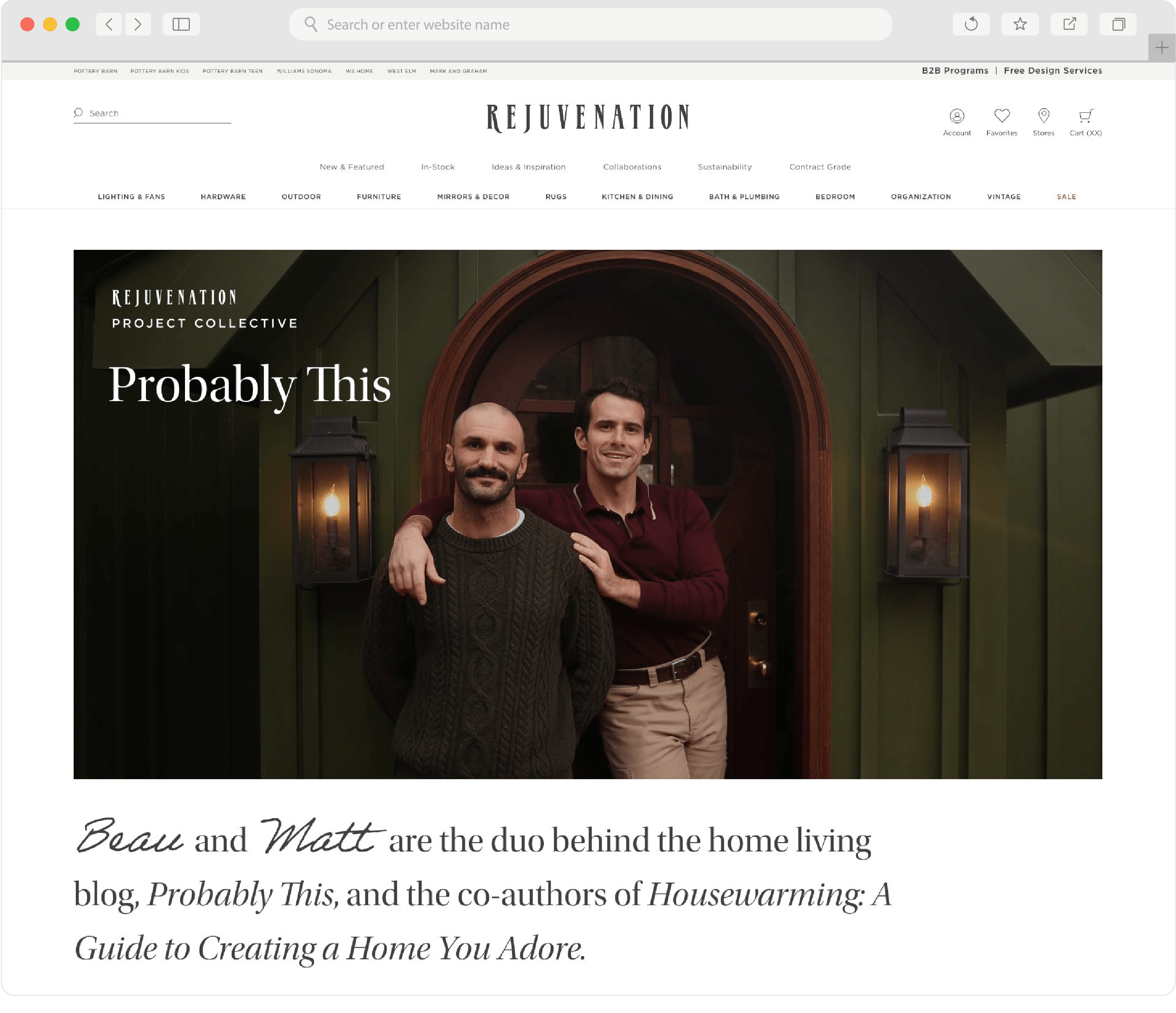
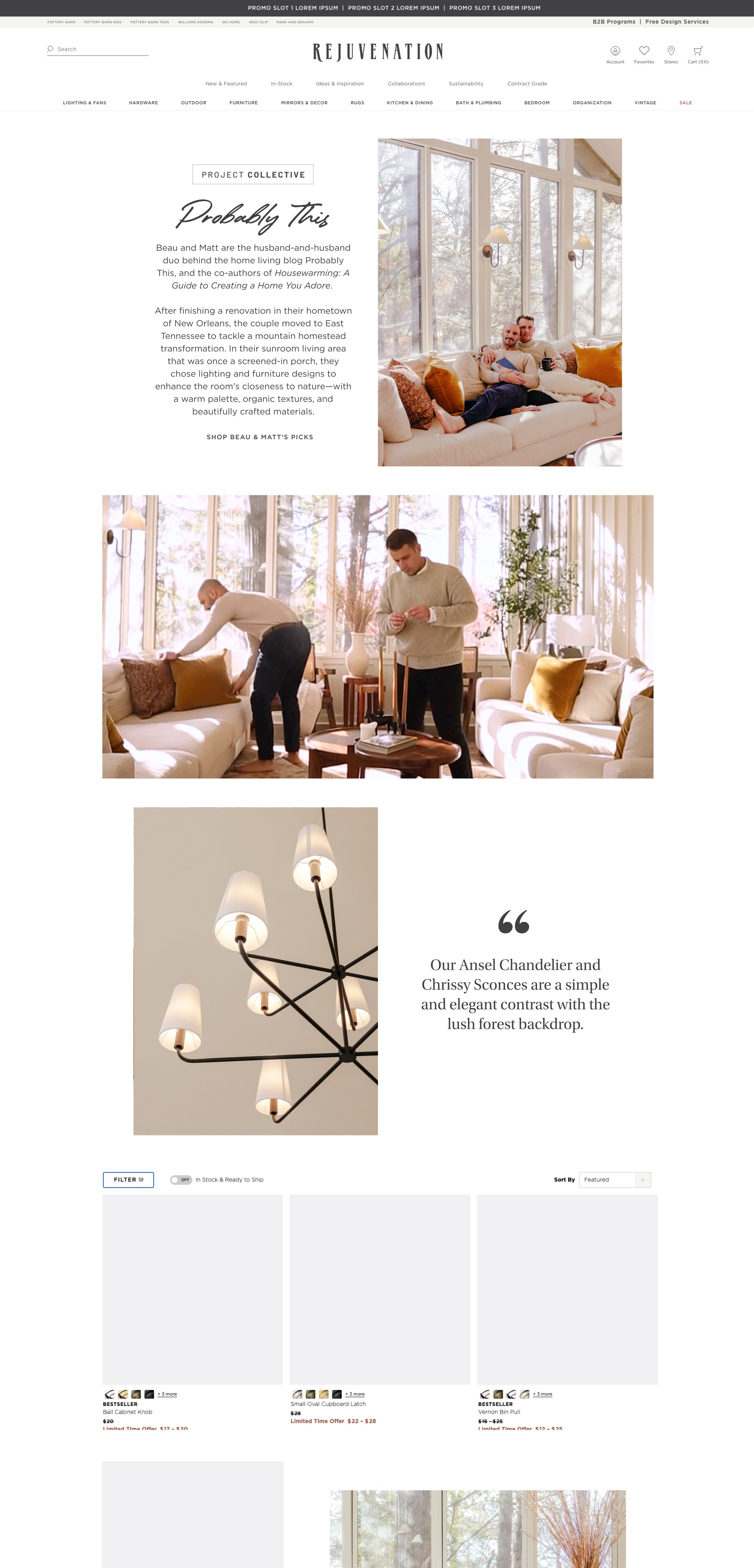
Project Collective Rebrand
Project Collective is Rejuvenation's influencer partnership program, spotlighting the creative voices who bring our products to life in real spaces. I performed creative work for the rebrand of the landing and partner pages, working closely with cross-functional partners to elevate the visual narrative.
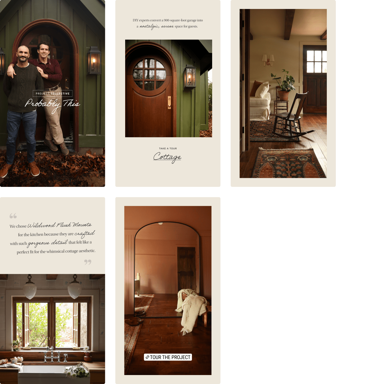
This project came from a functional request: to allow for multiple featured projects per partner.I introduced tabbed navigation to solve this in a way that fit the current site style.
Bringing Our Very Best
As I was presenting, I could sense the group had appetite for something more. I had done some preliminary moodboards and wireframes around what I imagined Project Collective could feel like, inspired by a handwritten style in combination with editorial elements to represent a creator's notes and inspiration.
 Early project moodboards
 Early project wireframes
The team responded positively to the directions, approving an expanded scope from a minor update to a full visual and experiential rebrand of the program.
Gathering Research and Other Strategies
Negina, Maria, and I researched competitor experiences. We noticed that most other competitors did not brand their project partnerships to this level. We were additionally encouraged by the human-first designs presented by Lulu and Georgia and Ralph Lauren.
 Competitive Research: Lulu and Georgia vs. Ralph Lauren
Getting Over The Finish Line
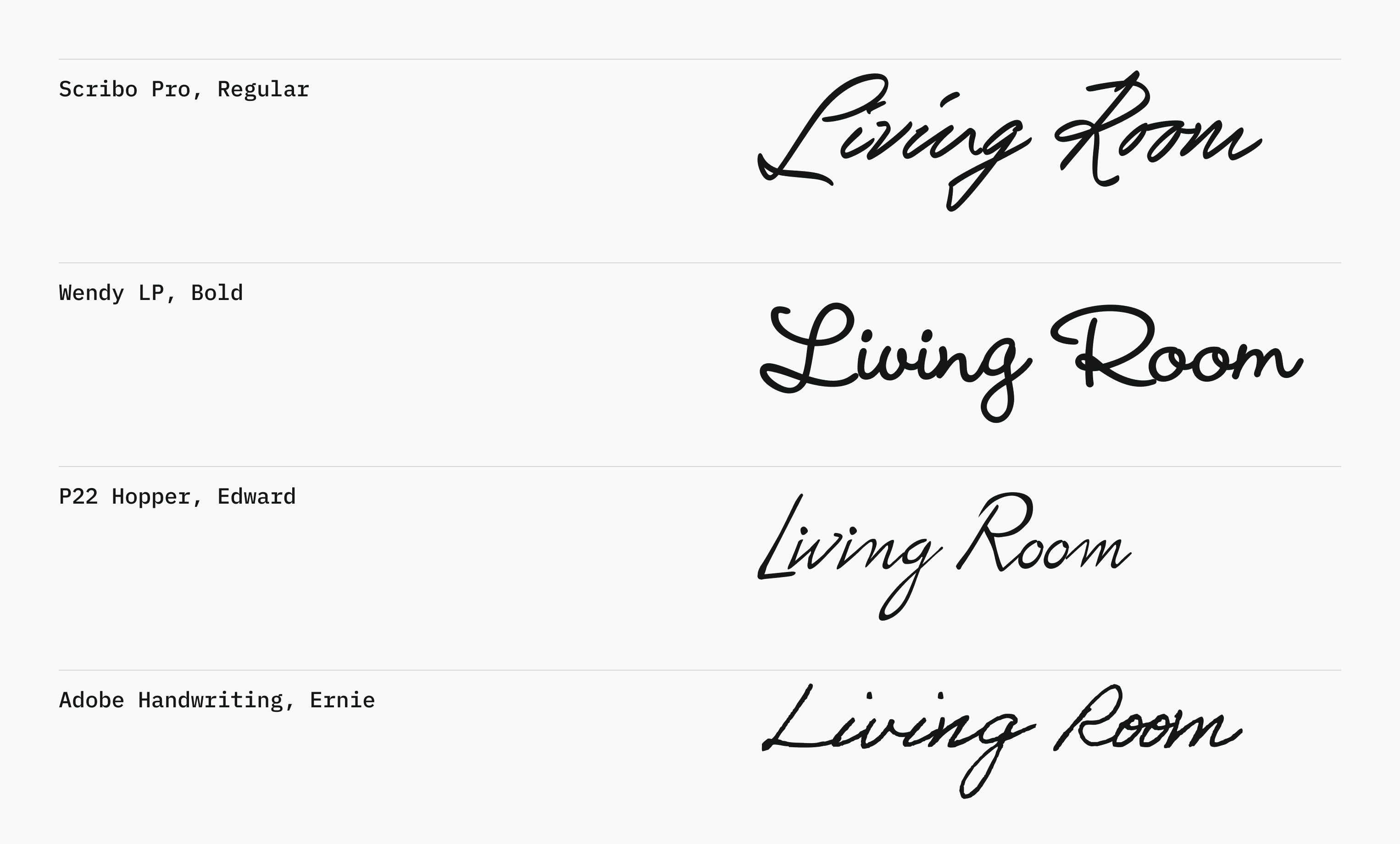
In preparation for review, I addressed a licensing challenge by replacing the previous Heatwood font, ultimately selecting Adobe Handwriting Ernie for its balanced, handcrafted style.
 Typography and editorial layout exploration
Leadership were excited about the work, and we worked through minor edits with them, quieting down certain areas of the visual style.